

PowerPoint Storytelling Reimagined with Live Power BI Data
In the world of presentations, PowerPoint is a timeless tool. However, as the demand for data-driven decision-making grows, traditional slides with static charts and text can no longer keep up. This is where the integration of Power BI and PowerPoint shine—allowing presenters to transform static presentations into dynamic, interactive storytelling experiences.

With the Power BI add-in for PowerPoint, you can bring your data stories to life. Imagine being able to present not just yesterday’s data, but the current state of your business, automatically updated and live within your slides. Better yet, you’re not limited to merely showing data—you can interact with it. Filter, drill down, and answer questions on the spot without leaving PowerPoint or searching for context in a separate platform.
Why Embed Power BI Visuals in PowerPoint?
While Power BI is known for its robust interactive data visualization, embedding these visuals in PowerPoint bridges the gap between dynamic analytics and traditional presentations. This integration enhances storytelling by allowing presenters to leverage real-time data in a familiar format, making insights more accessible and impactful for stakeholders. It provides a seamless way to communicate complex information interactively, all while retaining the structured narrative flow of PowerPoint.
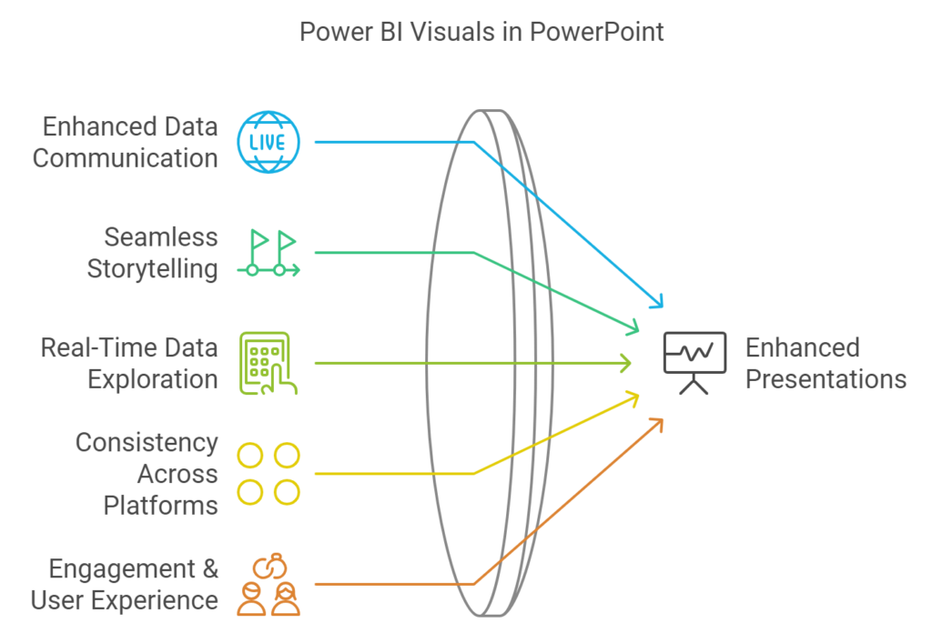
- Enhanced Data Communication:
- Data in Power BI visuals is dynamic, meaning it’s always up to date. There is no need to re-screenshot visuals every time numbers change.
- Seamless Storytelling:
- PowerPoint is perfect for structured storytelling, while Power BI excels at interactive exploration. Combining the two gives you the best of both worlds: the narrative flow of PowerPoint with the analytical power of Power BI.
- Real-Time Data Exploration:
- With interactive capabilities, presenters can adjust visuals in real time to address audience questions or delve deeper into a specific topic—without needing to jump back to the Power BI service.
- Consistency Across Platforms:
- Embedded visuals ensure everyone sees the same data, reducing confusion and discrepancies during meetings and reviews.
- Engagement & User Experience:
- Executives and stakeholders can explore data within a familiar PowerPoint environment, making it easier for them to engage with insights and focus on decision-making.
How to Embed a Power BI Report Page or Visual in PowerPoint
- Navigate to the Power BI service and open the report containing the visual you want to embed.

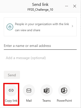
2. Hover over the reportname listed within your workspace. Select the Share icon.

3. Within the dialog, select the Copy link button at the bottom.
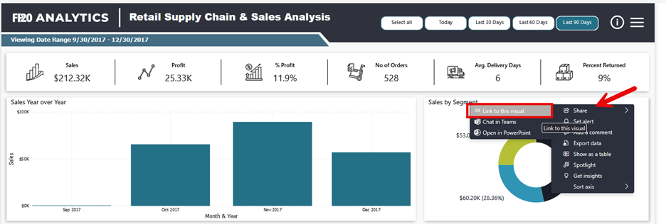
4. To generate the embed link for a single visual:
- Click on the three dots (…) in the top-right corner of the visual you want to embed.
- Select Share > Link to this visual
- Copy the link that appears in the dialog box
5. A dialog will appear, confirming that the link has been copied. Now, open the Microsoft PowerPoint desktop app on your computer. Select Blank presentation from the Home page.
*You may need to add the Power BI app to PowerPoint if it isn’t already available.
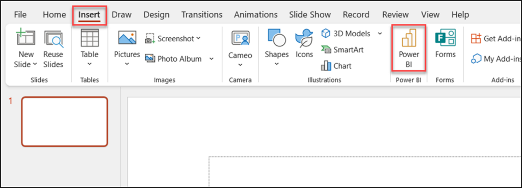
6. A new blank presentation will be created. From the top of the screen, within the ribbon, select the Insert tab.
Note: You can apply these steps to an existing PowerPoint deck by replacing the current static graph with this Power BI object.
7. Within the menu of options under the tab, select the Power BI icon button.
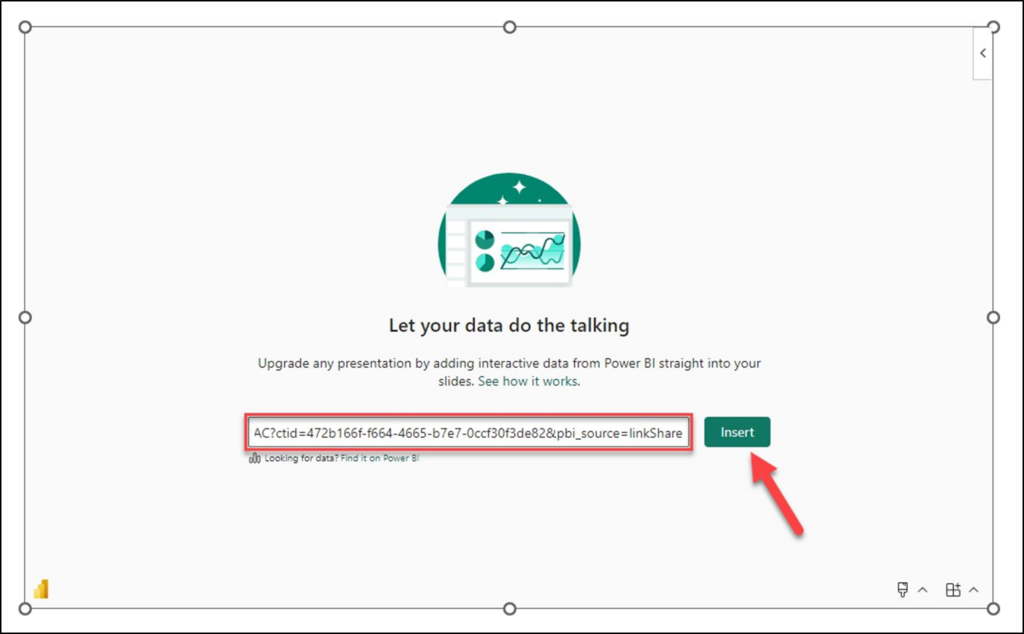
8. After selecting the Power BI button, you will notice that the blank presentation slide has a Power BI box added to the center. Within the center of the slide, select the text box that says Paste a URL from Power BI here.
9. Within the text box, paste the URL previously copied.
10. After you have pasted the URL for the report or visual, click the Insert button.
You should see that PowerPoint has added the Power BI report to the presentation slide.
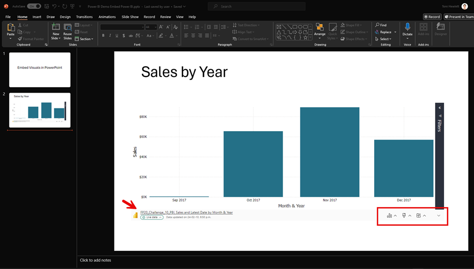
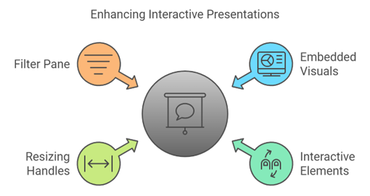
When viewing the slide, you can fully interact with the embedded visual. You can drill up or down through various data levels, click on specific locations within maps, or make selections on charts and graphs—updating the entire report dynamically based on your choices. You can also use the handles on the corners and sides to resize the visual for better alignment within your slide. Additionally, the Filter pane is accessible right on the presentation slide, providing more options to refine the data and customize your insights while presenting.
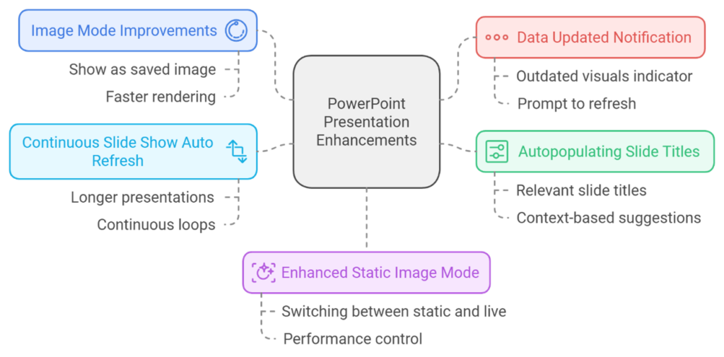
The latest updates focus on enhancing performance, interactivity, and ease of use for embedded visuals in presentations. These improvements make presenting up-to-date insights easier, streamlining title creation and managing visuals for continuous display settings.
For more detailed information, check out the Power BI updates page.